Lighting is one of the most forgotten or neglected part of any space planning, and yet go into any museum, gallery or store and you'll soon realise how critical it is to a successful project.
Your lighting design should incorporate three key aspects:
Understanding Function of Spaces
Every area of your project will have specific lighting needs - and modern kitchen design is a great example of how those needs vary across a relatively small footprint.
Food preparation and cleanup areas, for instance, need bright task lighting that is not taking up counter space - so whereas in an office, you can used task lamps, in kitchens you need your lighting built in to cabinets, appliances or overhead spaces.
Dining areas - including breakfast bar types - need a softer, more flattering light, so lower wattage pendant lights and chandeliers are more common.
Finally, accent lighting enhances the beauty of the new design, and might be accomplished with dimmable under cabinet lights, glass fronted cabinet backlights or soffit height lighting options.
Creating Visual Interest
There are beautiful lighting options available, and choosing the perfect fixture brings a room to life, and pulls together the whole design concept. Imagine the Bellagio hotel in Las Vegas without it's spectacular glass chandeliers, or the underwater lighting in their famous fountain display, and you begin to see how their lighting design is key to the experience.
Lighting must be chosen carefully to enhance the design rather than overpower it - a fixture that is lit will automatically draw attention, so make sure to view in person wherever possible to understand both the physical and visual scale of your piece.
Balance
One of the common challenges in any design is not just to bring light into a space, but to balance it with the available natural light, so that the overall feel is one of harmony and flow. Think of the difference between a bog box wholesale warehouse and your favorite 'light and bright' coffee shop. Both will be clean and well lit, but while the first will seem open and spacious, the second offers additional warmth and a welcoming, intimate feel.
Featured Kitchen Remodel Project: Before
- The three aspects are very evident in our featured project. While the rest of the house had wonderful natural light from it's expansive window the kitchen area had no windows onto any of the workspaces.
- The existing lighting added to the cramped feel. Pendent lights over the breakfast bar, intended to add light and interest, instead blocked the line of vision.
- Under-counter task lighting was poorly positioned so that it illuminated countertop appliances instead of functional workspace. The main remaining counters were reliant on the pendant lighting or appliance lights for illumination.
- The recessed lighting should have added more overall illumination to the space, but the dropped ceiling meant that while the kitchen itself got some light, there were large dark areas. The partition wall blocked off light from the entry and dining area, and the high breakfast bar left little of the light from the family room reaching the work surface.
Before: The lighting was inconsistent across the space, creating pockets of darkness that made the space feel small and less welcoming. The dropped ceiling added to the cramped, unbalanced appearance.
The Lighting Design Solution
Johanne's use of the 3D design technology proved instrumental in the client lighting decision. Initially, the layout removed the partition wall to increase natural light from the dining area, and replaced the multi-level surfaces with a large single level counter and island to prevent recessed shaded areas.
However, Johanne also explored the possibility of raising the ceiling, which expanded the visual space and allowed the inclusion of a skylight over the main area. This substantially increased the scope of the project, but being able to virtually see the impact of the proposed change made the clients give the project their enthusiastic approval.
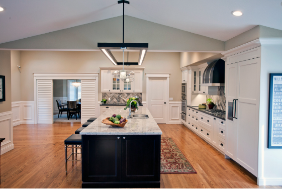
The After shot shows the huge role that a skilled lighting design has in the design process. Points to note include:
- Light, bright, welcoming feel to the space
- Appropriate lighting for each space - dimmable over-counter feature lighting offered bright light when needed, but could be dimmed to also create an attractive glow. The attached pendants could be used independently or in combination when the space was being used for entertaining.
- Natural light enhanced by removal of partition wall and inclusion of skylight. The use of white cabinets also added to the light and bright feel that reflected the style of the rest of the home.
- Carefully positioned recess lighting ensured a balanced lighting level across the entire main space, making the home feel larger.
Most importantly, while the feature lighting fixture over the island adds even, controllable lighting across the whole working area, it also provides a visual transition across the multiple ceiling heights and aspects, and visual anchor for the island.
It is one of our favorite examples of how well designed lighting is pivotal to the success of any design project!
Again, Johanne's use of the 3D VR design software meant that she and the client could experiment with different locations, types and intensity of light, as well as test out the look of different styles of fixtures to find the perfect balance and blend. It helped the client feel confident enough to commission a custom lighting fixture that otherwise might have been overlooked.
In the next post, we'll be looking at Step 3 - Adding A Sense of Luxury


